

I found researching gallery eye opening as it demonstrated to me that there is a variety of ways in which you can demonstrate you work in a visually and aesthetically pleasing way. My first thought was that they would be lined up in a black frame on a white wall, but there are so many other ways in which to make the images pop out and standout to the members of public.
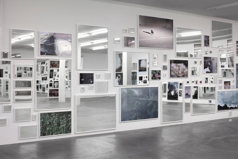
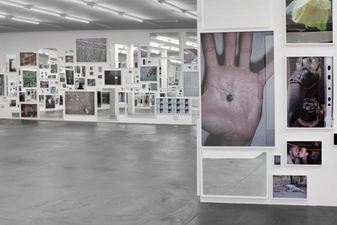
These images here are from the Gallery Exhibition ‘thisistommorrow’ by the photographer Douglas Gordon. I chose to look into this exhibition specifically as I loved his used of composition within the gallery and how he organised his images on the wall. Something that I also recognised from his exhibition is that he incorporated other objects along side his photographs to add more definition and effect towards his project idea. This is a style that I loved specifically on the composition, although I don’t think that I will use other items around my photographs as it doesn’t fit in with the idea of my project.
Another style of exhibition I have looked into is Juan Margolles exhibition called ‘Growing Up’. Within this layout it is very different to the previous example I looked into. His style is very simplistic with a neat and organised look to it.
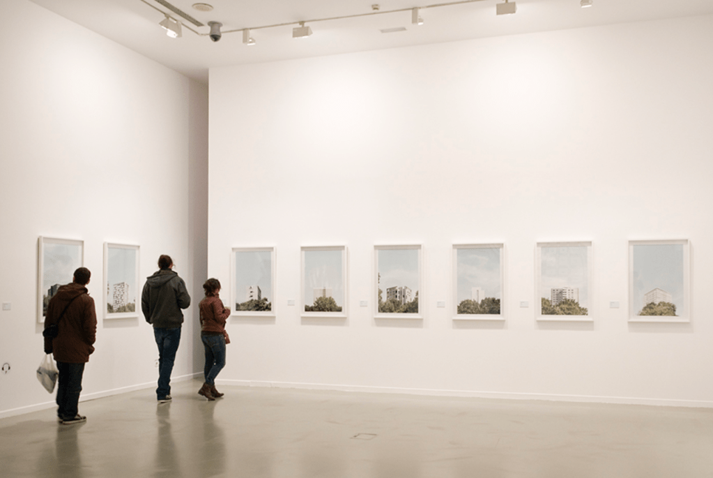
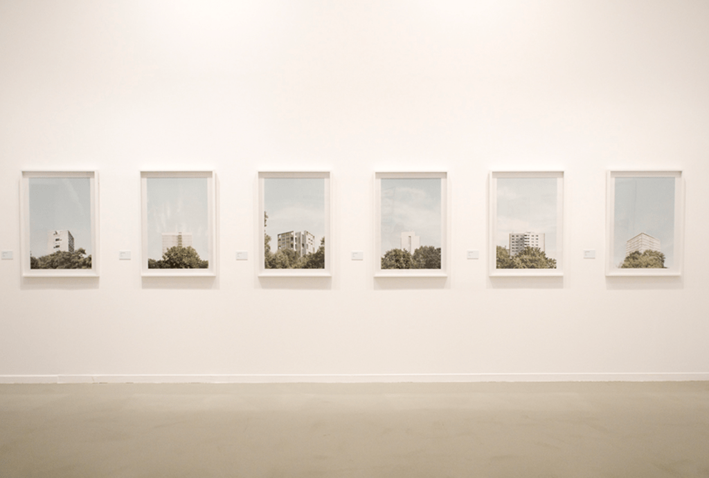
I loved the crisp clean feel that it has to it and how it shows his work in a very simplistic yet effective way. Something that I will take into account when putting my exhibition together is space as I have very limited space to use, so I have to be aware of where the most effective positioning will be. One thing that is similar in both exhibitions is that a white background is used for both. This makes sense as it a basic and bright backdrop to demonstrate your images in the best light. Another element that is vital within an exhibition is lighting as you need to highlight you images a best as possible. looking at both I can see that slightly different techniques have been used in order to accentuate the images. I think I prefer Juan Margolle’s way of lighting as it seems brighter and crisper with less of an industrial feeling.
Another Photographer I looked into was Adam Jeppesen where he presented his work ‘The Pond’ in the Martin ASBÆK Gallery in 2017. Something about this exhibition is that is very different to previous examples I have looked at as the artist has to work with the architecture of the building and work with the natural workings of the building. This I thought to be very visually interesting as he has to base his art around the building instead planning his work on a flat surface.
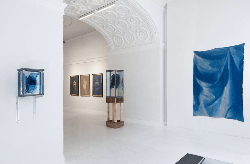
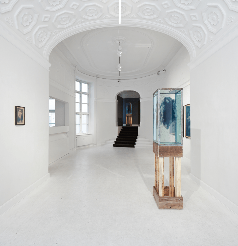
Above is his work from the gallery exhibition. Something that I loved is that he took in the beauty of the architecture and based his work around it. This is something that I want be able to do as it will be placed on a plain wall, but I loved the difference in the style of show. This again is different he has spaced out his work, I think in order to really take in the intricate and interesting engravings and shapes of the rooms.
Overall I have found it helpful looking into these different types of exhibition ideas and it has given me some more ideas on how I would like to space out my images.
