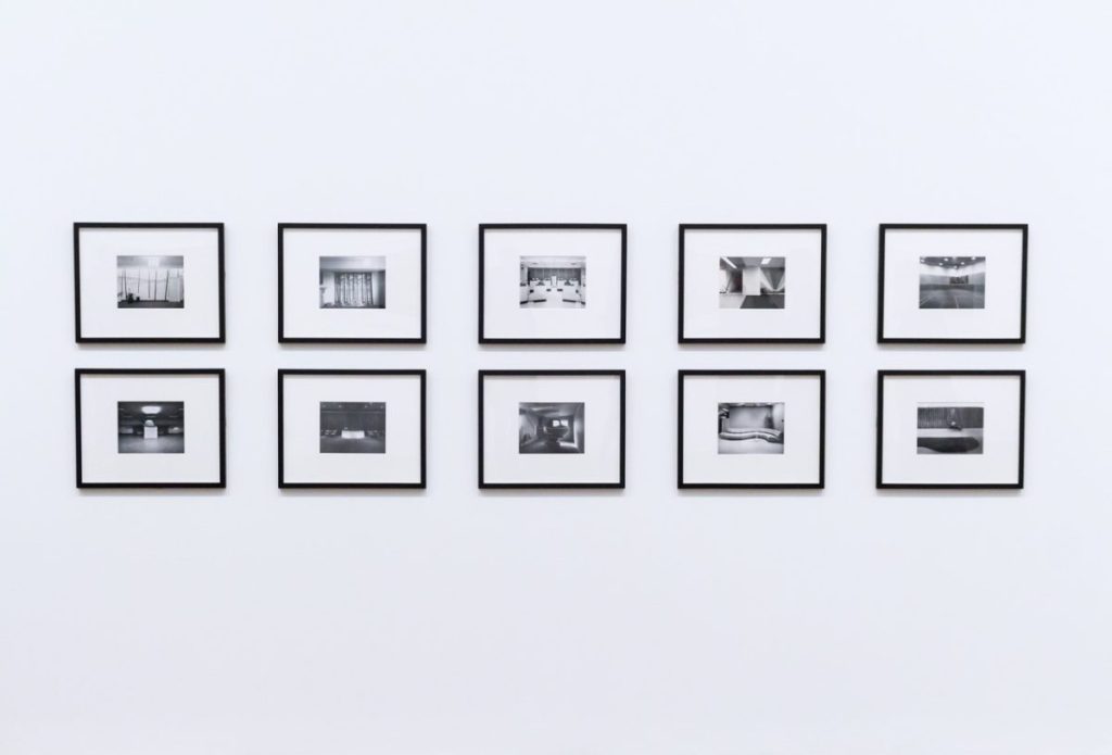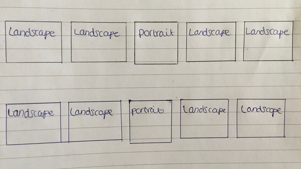
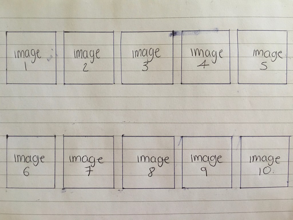
After much consideration over how, I wanted to stage my images this is the final layout that I have chosen to do. I would have printed my images out and laid them out in front of me, however, I was unable to print anything out due to the lockdown. So instead I just labelled the frames with numbers. Originally, I had planned to lay the out in an order that I think best suited the images, however on further inspection they didn’t fit very well as there did seem to be any constancy in the size of the photos. After acknowledging this I chose to rearrange the images so that after every portrait two landscape images followed. This allowed there to be symmetry and consistency, something which I believe to be critical within a photography exhibition.
When getting the pictures ready for print I chose to have all of my images at A3 (420mm x 297mm), I found this to be the perfect size as I think that it will help demonstrate the pictures in their best light. I also wanted a boarder around my images to help frame them as I want my images to be placed into a neat thin black frame. I wanted the boarder around my images to be reasonably small as I didn’t want it to take up to much of the frame. I did this by settling on a 10mm frame around the images, adding a nice white boarder for the photos.
With the images being split into two separate rows I would place the artist statement in the bottom left hand corner, so the viewer can read the artist statement and get an idea of what my project is about before they scan through the images.